The Things Stack is a LoRaWAN® network and device management software that enables users to deploy a fully featured (e.g. APIs for device management, data routing, and application integration), enterprise-native, developer-friendly system in minutes and scale it seamlessly to millions of devices.
100 699 active users
2 114 009 connected devices
100 830 connected gateways
4 000 messages per second
This software is used to connect, debug, and manage IoT devices and gateways, but also create and share projects, read data report, analyse metrics. We realised the user experience is very much engineer-oriented and is not tailored to non-technical users. Which makes it difficult for them to navigate and use the platform effectively.
The team is made of 1 product designer (myself), 3 developers, and 1 project manager.
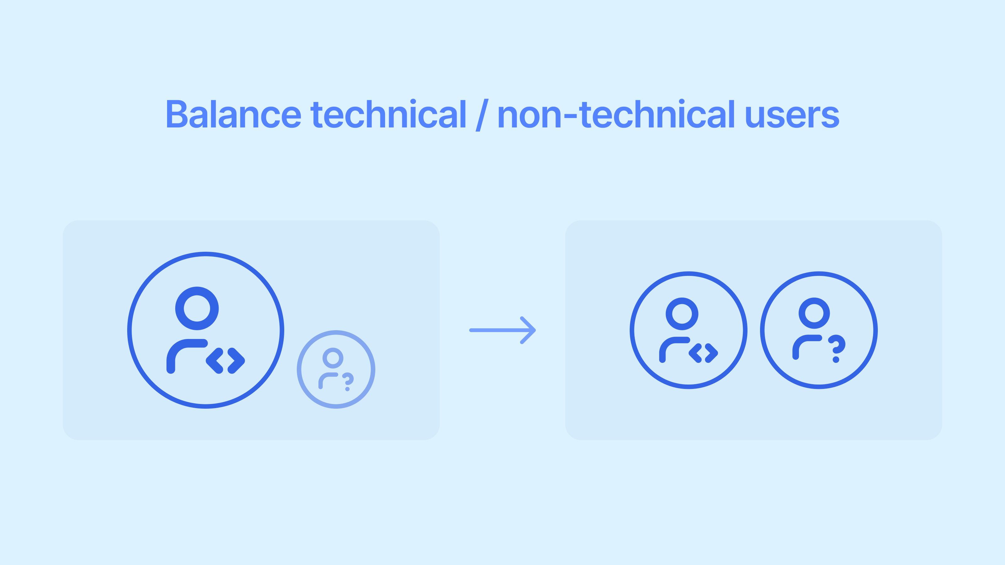
My goal was to make the product more accessible, more intuitive and less scary for non-technical users.
Having a more user-friendly interface opens up the product to a wider audience, including non-technical users.
An action that was before requiring two people now only needs one.
By definition, improving the accessibility makes it easier for users to complete tasks more quickly and efficiently.
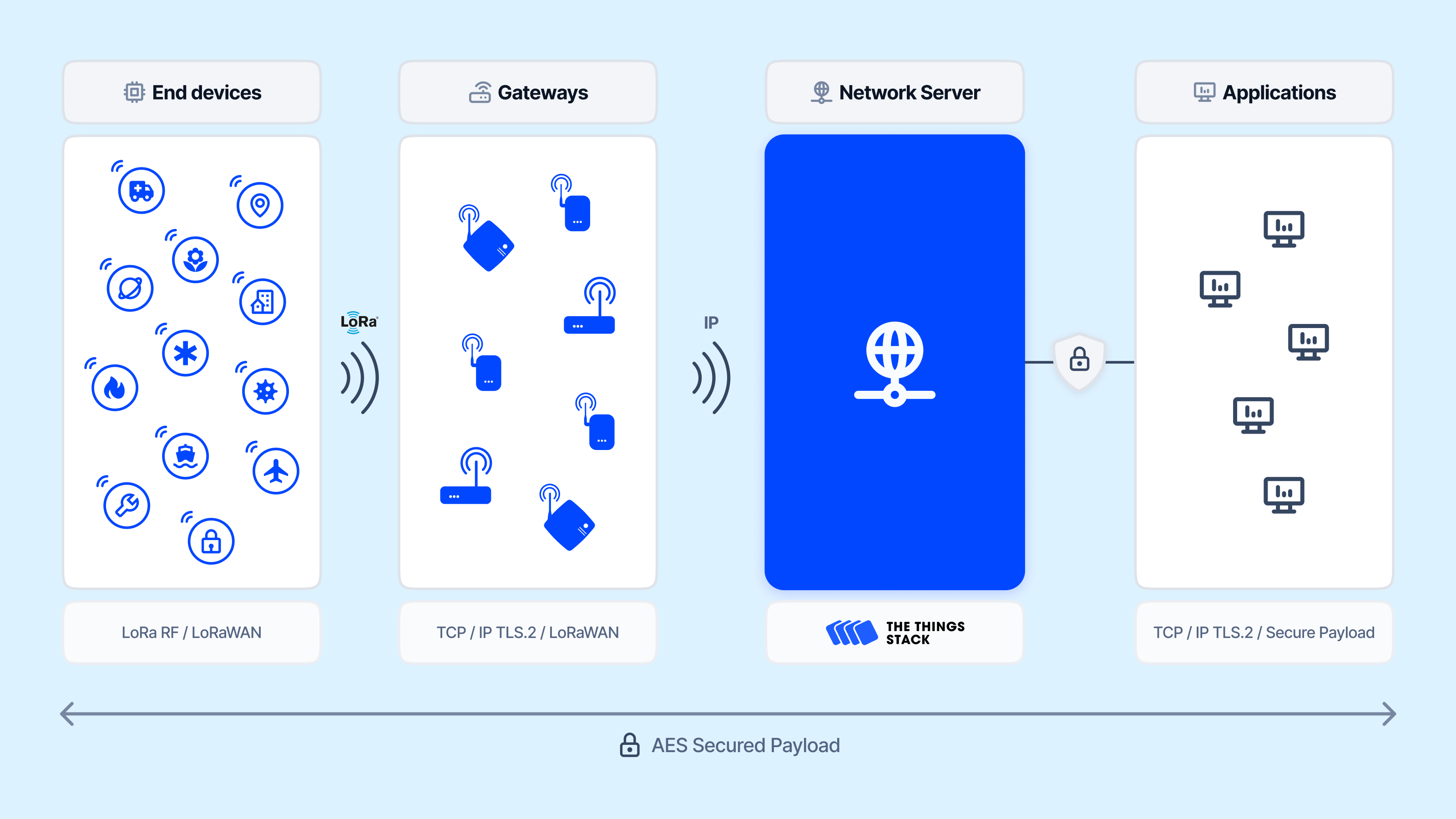
The software’s navigation structure is complex, spanning multiple entities (end devices, gateways, and applications)
Previously, we overemphasised Applications and Gateways using a segmented control, which created a fragmented experience.
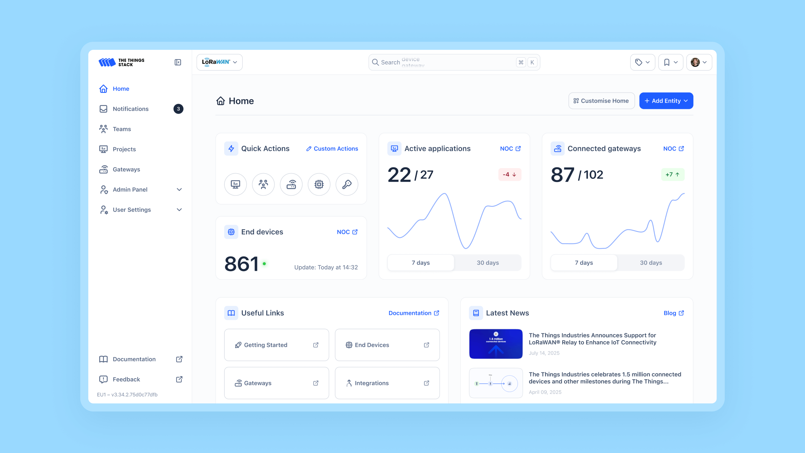
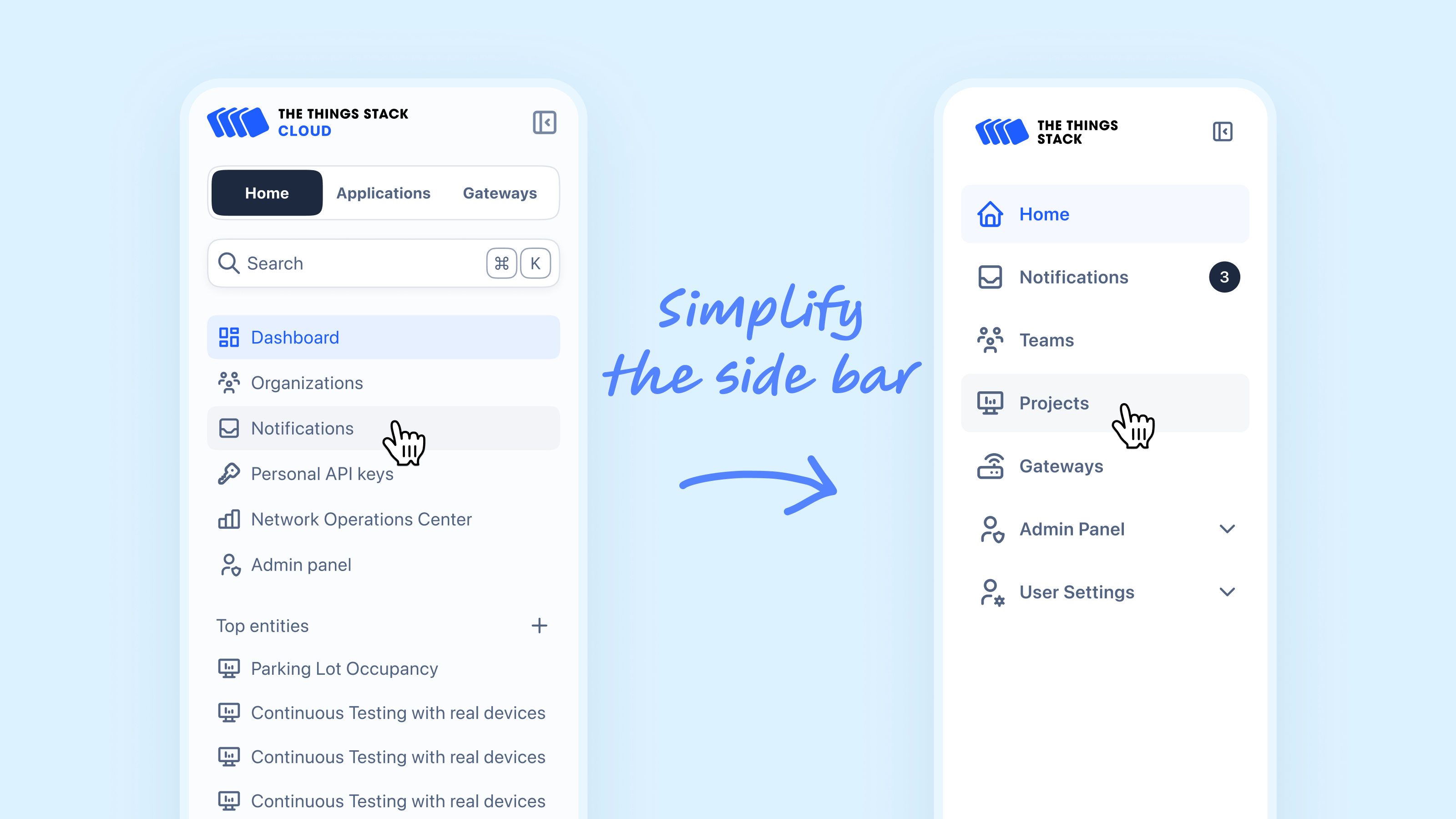
By restructuring the navigation to align with standard software UX patterns, we made the product more intuitive and cohesive.
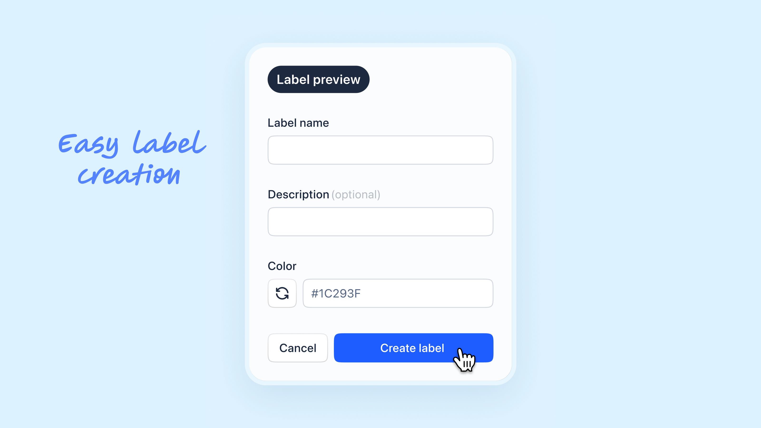
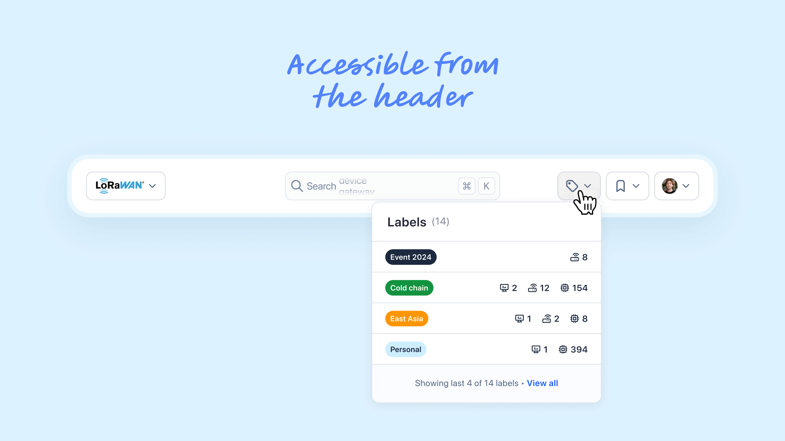
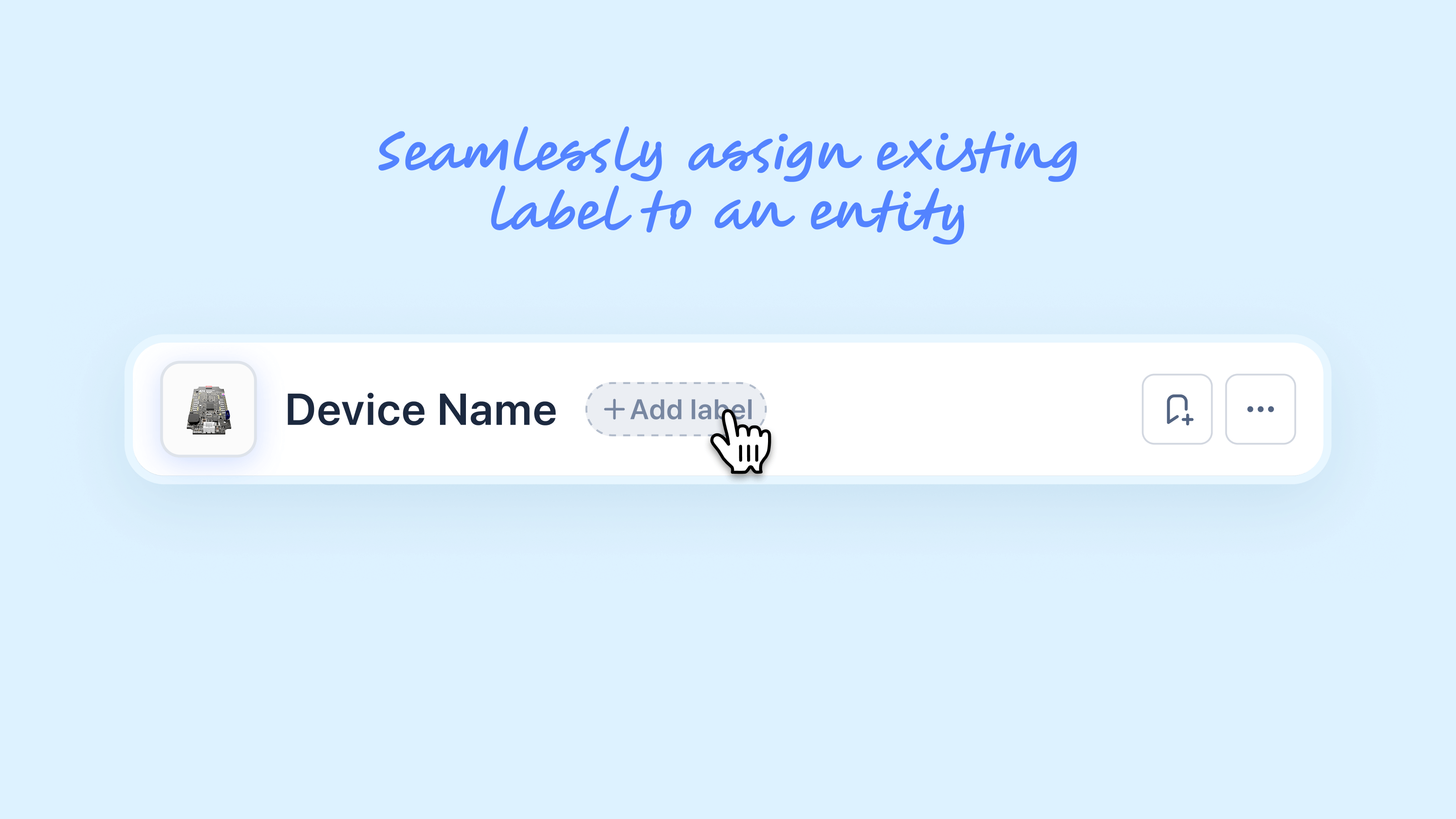
The Things Stack is a complex system with many interconnected entities. Introducing a label feature enables users to create, edit, and delete labels across different entities, improving organisation and project management.
This feature provides a more efficient experience for all users—technical and non-technical.
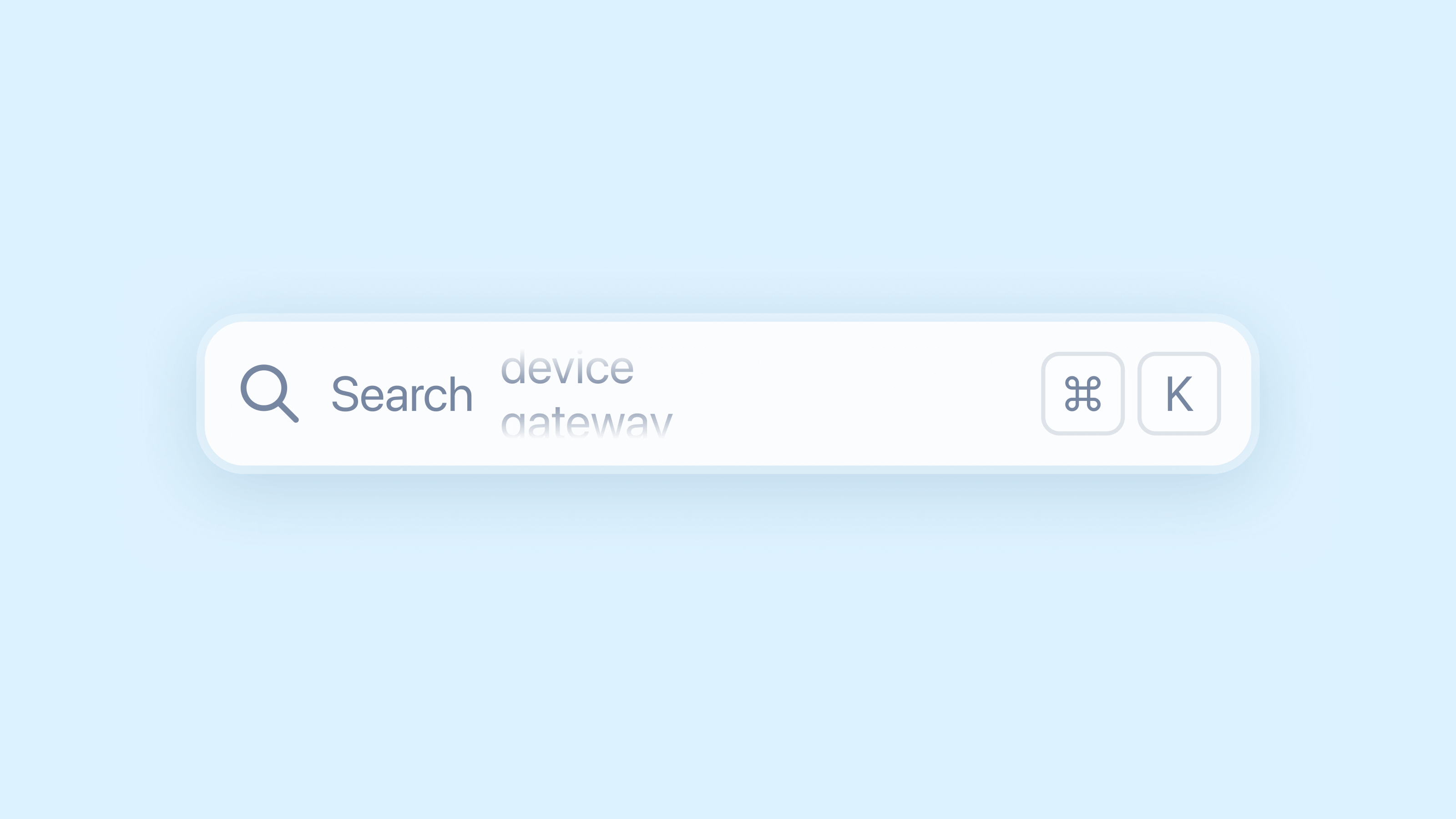
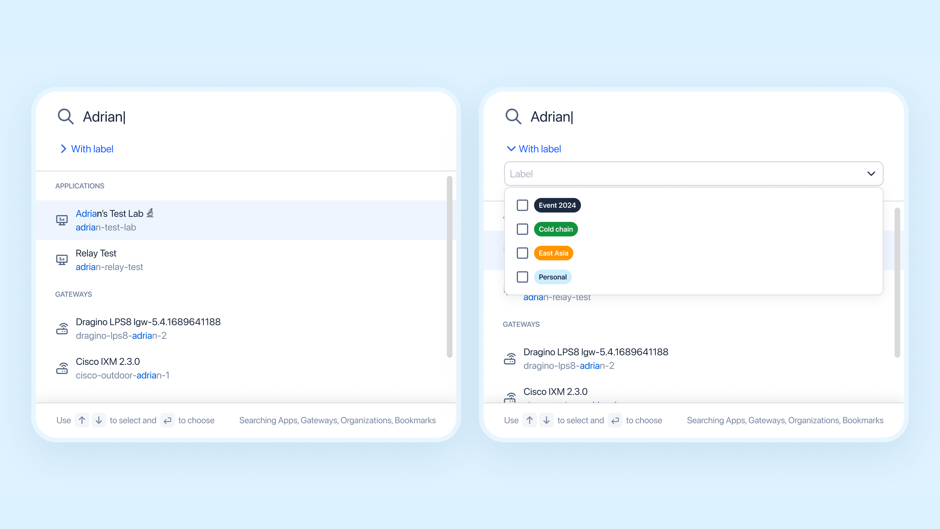
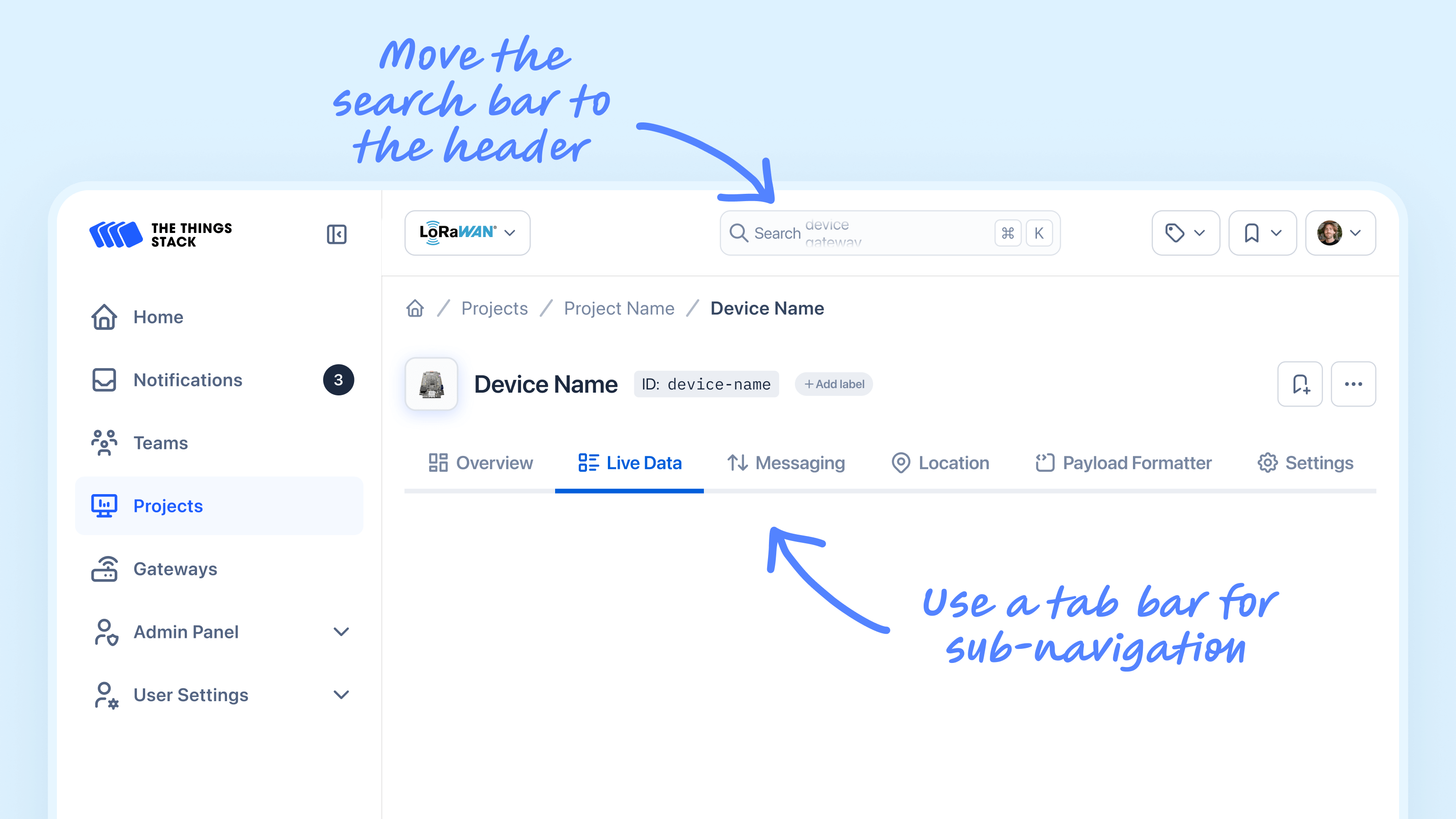
After some feedback sessions with our users, we realised the search bar was one of the most used components in the application. We decided to enhance its functionality by adding features like shortcuts and filtering options.
We also decided to move the search bar from the sidebar to the center of the header to make it more accessible.
We use ![]() PostHog to make our decisions data-driven and identify usability frictions.
PostHog to make our decisions data-driven and identify usability frictions.
Analysis showed that a generic “Add” button with a dropdown in the header caused confusion on specific pages. We replaced it with context-specific buttons (e.g., “Connect Gateway” on the Gateway page).
Additionally, user feedback revealed that the term “Applications” was unclear (while correct on a technical level), so we renamed it to “Projects.”
These changes aim to reduce friction and enhance overall usability.
Throughout the process, we have regular review sessions with stakeholders to gather feedback and ensure alignment with business goals.
But also with the developers before implementation to validate design feasibility and ensure accurate execution of all functionalities.
![]() Thank you for reading
Thank you for reading
More details available on request: pierre.philouze@gmail.com